Blast-off! And 50% Off!
And to celebrate a successful year of writing, publishing and living….

Location: Punta Gorda, Florida
In this issue:
- RV Rally Fun
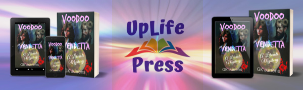
- Voodoo Vendetta en route to Worldwide Distribution
- Case Study – Evolution of a Book Cover
- Ice Ops – A Short Story
- Year-end 50% Off All My Books!
1. RV Rally
Once in a while, we hang out with some Uber-interesting folks who share our passion for the nomadic lifestyle–the life of itinerant vagabonds.
The Full-timer’s chapter of the Newmar Owner’s Group gathered right here in our town, Punta Gorda in Southwest Florida. Kay and I so enjoyed seeing everyone again.
Fun fact: the RV Park that hosted our rally (food, fun, games, music, tall tales), Creekside RV Resort, saw forty rigs topple during Hurricane Ian’s onslaught. Not so much fun, however, for their owners. None of our group suffered damage as we go where the storms aren’t. When your home has wheels and catastrophe approaches, we beat feet.
We took this opportunity to enjoy a harbor cruise and a Christmas lights canal cruise with our RV friends. We also toured the Edison/Ford museum in Ft Myers. After living here for twenty years (when we’re not traveling), this is the first time we made it to that museum.


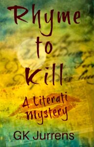
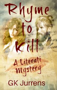
2. “Voodoo Vendetta” is on its way around the world
My ninth novel, “Voodoo Vendetta – A Literati Mystery” is officially available in both ebook and paperback editions in a bunch of online stores now (Amazon, Apple, Kobo, Smashwords…), and on its way at cyber-speed (faster than snail mail) to all the rest, worldwide. Including library services and reader subscription services (except for Kindle Unlimited which requires exclusivity–nope).
You might guess that launching a new title is exhausting. And you would be correct. So many details to manage. Everything has to be, well, perfect. And it takes a village.
While I’ve reduced the process to a straightforward workflow, it’s still a ton of work. As I reported in my last newsletter, early readers are loving this locked room whodunit murder mystery with myriad twists and characters you’ll love and hate, but for good reason. Some, you won’t be sure what to think.
As an adjunct, I thought some of you might like to see how this book’s cover evolved over the last few months based on useful but brutal feedback from readers and designers. If you’re interested in this sort of thing, keep reading. Otherwise, skip to details below on the huge year-end book sale to see how to save 50% on all of my titles, and a bunch of others.
3. Case Study – Evolution of a Book Cover
Never judge a book by its cover.
I.M. Naughtwriter
Poppycock!
In fact, the right cover is any author’s most powerful marketing tool. A great cover needs to:
- Grab the casual shopper’s attention in two seconds or less, either in a bookstore, or online
- Entice the online shopper to make a snap judgment from a thumbnail, a minuscule miniature of the book’s cover. That’s asking a lot from a picture the size of your thumbnail, and a design requirement often overlooked by rookie authors,
- Identify the book’s genre (a murder mystery’s cover will look and feel very different from a romance story’s). This is more look and feel. Best achieved by studying other successful authors in the genre,
- Set appropriate reader expectations with its title, font, color, text (back cover) and graphics.
Conversely, a not-so-great cover WILL be costly in lost sales. Worse, you may never know.
With each new book I publish, I am humbled by how much I still don’t know about book cover design. But I’m stubborn, and a control freak, and cheap, all of which prevents me from hiring a professional designer for each book. Plus, I enjoy endlessly tinkering with my covers’ designs.
So, I study the covers of other books in my genre–the ones that sell well. Even then, the most prominent feature on a famous and well-established author’s book cover will probably look very different from what my cover needs.
For example, what is the most prominent feature on the cover of a book written by James Patterson or JD Robb or Tom Clancey? Their name, of course. That makes no sense on my books because I’m not famous. Yet.
After tinkering, soliciting feedback, and more tinkering, I will still doubt my own cover design–the perennial paradox–one of many. For me, anyway. I know… madness.
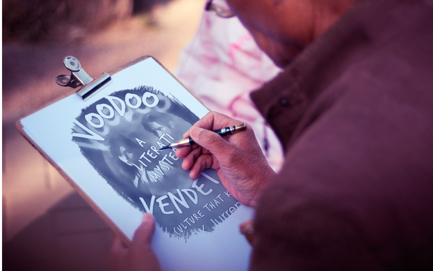
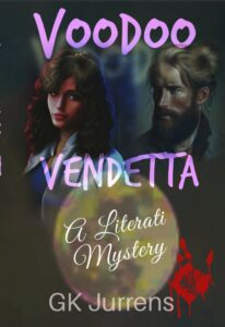
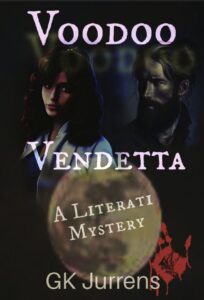
Enough foreplay. Here are just a few of the dozens of iterations I went through for Vendetta’s cover.
I also ground through several evolutions of the rear cover. I won’t bore you with that, but this darn cover drove me crazy. For months.
Thankfully, I received lots of constructive feedback. The final cover below also looks good as a thumbnail, I think, which is critically important for online sales pages. All the text is still fairly legible when reduced to a very small image. The title is a unique color and in a distinctive font called “Trash Hand.” I like that, as did reviewers:
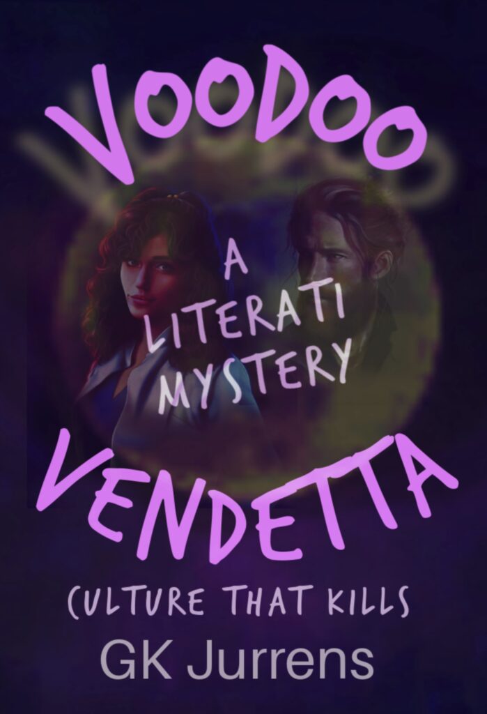
Dark like the book’s theme. Much takes place in dark basements and tunnels, involves a mysterious (“dark?”) religion, and more than a few devious (dark?) characters and plot twists.
Plus, of course, murder.
Limited fonts (2) with smoky shadows, with a provocative tag line (“Culture That Kills”). Composite images are subtle but suggestive (not visually cluttered).
Emphasizes a singular visual focus (the book’s title) with the series subtitle that grabs less focus, but still prominent (“A Literati Mystery”), which will appear on every cover in this series. One topic of continuing debate: characters’ faces on the cove? Or not? Screw it. I like it.
Decision made! Done, already!

So, there you have it. A study in dark lavender. As one of my villains in this book says:
“Black is the new white. Reminds me of Moskva’s winter nights after curfew, but without the cold.”
Tihomir Leonov
A cover doesn’t have to be pretty, but it MUST be effective.
4. Ice Ops – A Short Story
I’ll be publishing a collection of short stories in 2023. I offer you an advance peek at one that means a great deal to me. I hope you enjoy this free sneak preview.

“Ice Ops – A Rescue Mission” is a chilling true account of life over death for more than thirty souls, and the genesis of an injury for yours truly that persists to this day. If you are so inclined, you can read it here.
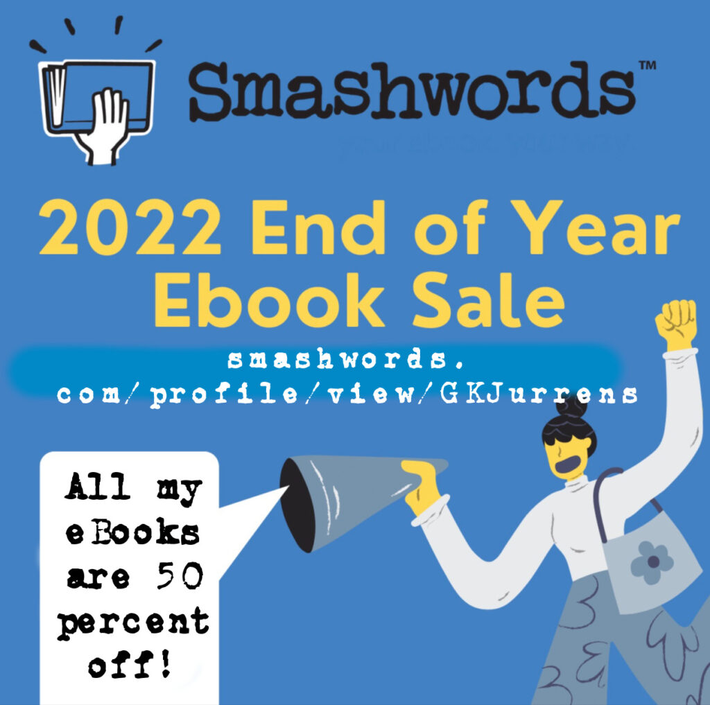
5. Year End Sale 50% Off
That’s right. I’m offering 50% off the eBook edition of all my books–even my newest–on Smashwords (an Amazon alternative).
Just in time for the year-end holidays, click here between December 15 and December 31, 2022 to snag these great deals. Or simply click on the image below:
That’s all for now. So, until… and wherever, my friend…
Happy Holidays!
Gene

One Reply to “Blast-off! And 50% Off!”
Loved the Ice Ops short story! I can’t wait to read the other short stories. Your attention to detail is amazing.